
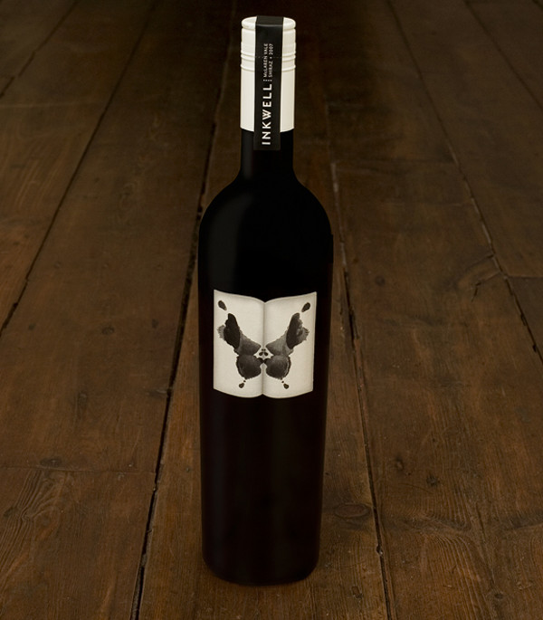
Just as every wine may effect each palette differently, the Rorschach inkblot test’s meaning is different to each viewer. With this bottle design, Inkwell Wine asks, “what do you see?” Wine: so much cheaper than therapy.
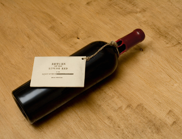
The crew from /M/A/S/H/ returns to this list with a special bottle for Redheads Wine. A collaboration with Redheads Studio yielded a bottle called “Return of the Living Red”– a simple, provocative design with a throwback to classic horror films. Because zombies need something to wash the brain down with.
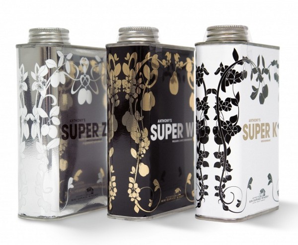
As long as you don’t store these wines in your garage (especially next to the turpentine), you’re in for a tasty treat of packaging design. The Mini Garage Wines and Brandies by Anthony Hammond have a literal conception– Hammond’s wine is produced in a former tractor shop in Germany. When we move to the suburbs, I am so getting a workbench in the garage...with a glass rack.
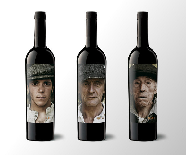
A quick glance at these bottles instantly communicates this winery’s main value– three generations of expertise. The Matsu Organic Wine bottles show the history of this wine from grandfather to grandson, showing the focus this family has put into its grape over these generations. My plan is to start off with the young hottie and move down the line. I'm pretty sure by the third bottle that Grandpa starts looking like George Clooney.
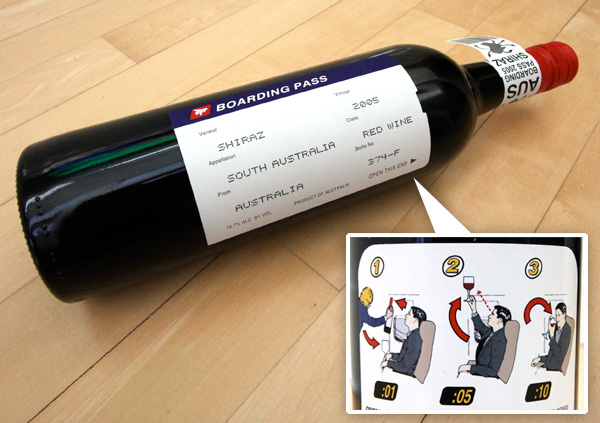
An instant classic, the Boarding Pass Shiraz label is one of the most creative theme-based designs in recent years. The front label is essentially a boarding pass with the travel details replaces with information about the wine. I can only imagine the line for the restroom on that flight.
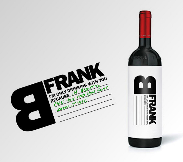
The best part about B Frank Wine’s label is the part you add yourself. If it’s time for a heart-to-heart with a friend, co-worker or lover, this is the bottle you want to have handy. Just be frank, speak your mind and get it out in the open. This design is the work of Talia Cohen for the B Frank digital marketing agency. I think this would be even better if people had to fill in the label AFTER the contents were gone...although most times it would probably just say "becaush I loves ya man..."
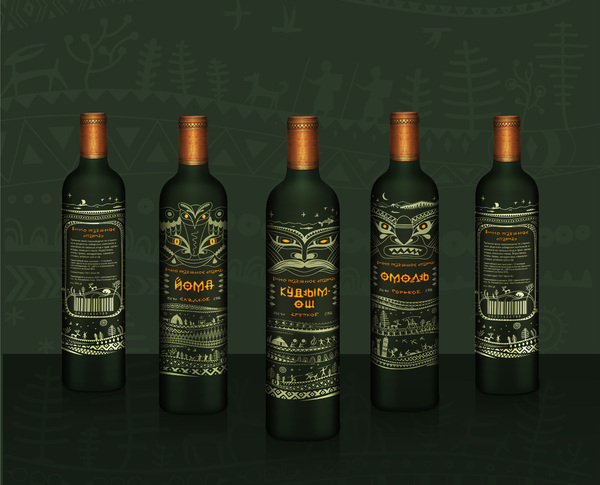
Designer Raya Ivanovskaya has put a wealth of cultural flavor into the Vine Parma Wine design. Wrapping around this bottle are hieroglyphics, totems and a mystic language telling tales of times past. Thank goodness there is finally something to bring to that next voodoo ritual I'm invited too. The chickens were becoming cumbersome.
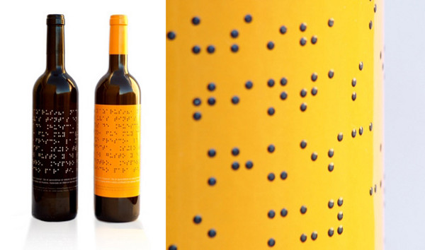
While this label may be a tough read for the layman, its design is strikingly attractive to those who cannot understand its language. The Lazarus Wine bottle features a label printed in big, bold braille with either a black or yellow background. If a blind man drinks this, do the girls still get prettier?
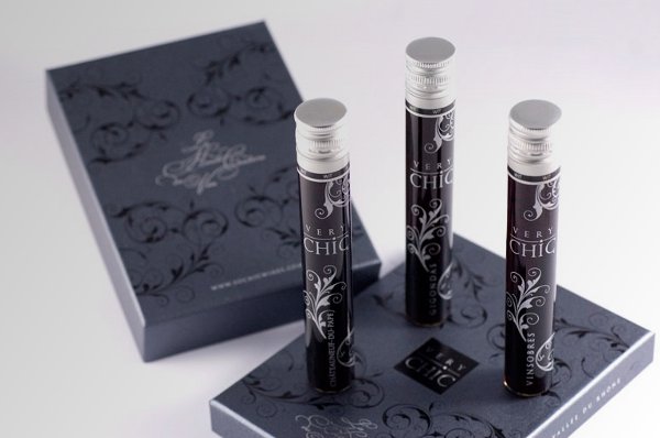
All you need to get to know a good wine is to take a slow, calculated and careful sip. Very Chic Wine hopes to make an impression before you sample with this attractive, floral-inspired packaging. Because nothing says Klassy like a wine bottle you can slip into your tampon carrying case...just sayin.
5 comments:
Of course, none of that design matters if you leave the bottle in the paper sack while you drink it.
Those Matsu guys look like a time-lapse of some dude's face melting.
No edible bottles?
WV: hailism
Religion centered around flagging down taxis.
I like the idea of the Braille bottle. Even when you are blind drunk you can still find the right bottle.
The turpentine can looks wicked. I really think the braille bottles are genius.
I love love LOVE the Matsu Organic wine bottles with the three generation pictures on them. That is beyond cool.
Of course the first image should be named: “Be Frank”, instead of Frank B. That’s the purpose of the label: be honest (be frank) I am only drinking, blabla. I like the post though. Most of the examples would have made me run for the water shelves. Horrible. Showing, IMO, producers who seem to care more about what’s eye catching on the outside of the bottle than what’s inside the bottle.
Post a Comment